
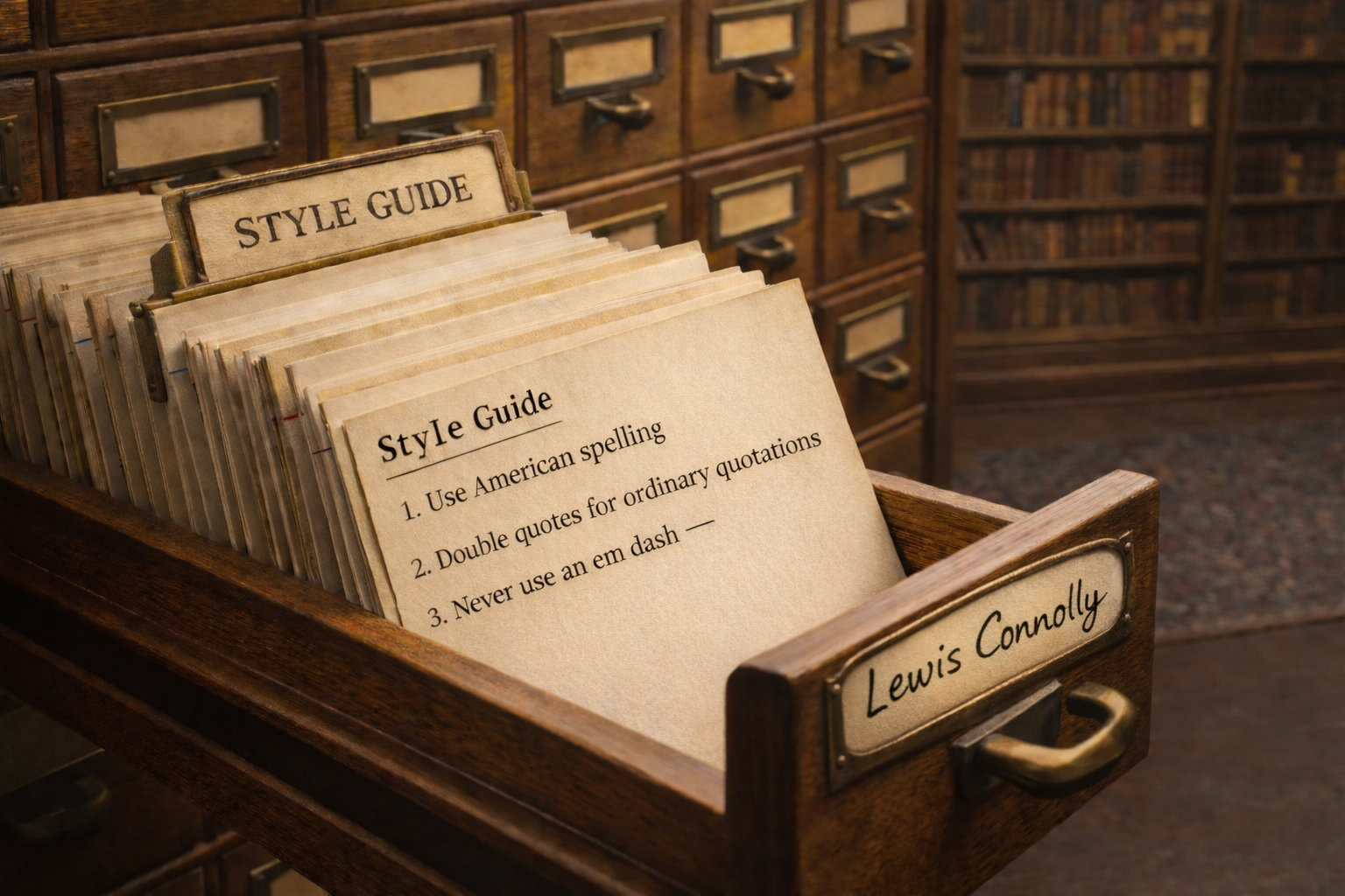
LewisConnolly.com Style Guide
Every writer eventually ends up having the same arguments with himself over and over: whether to use single or double quotation marks, how to handle quotations and citations, whether to follow British habits or American ones, and so on. My own higgledy-piggledy state of affairs is partly the result of my education. I was taught three different ways to format essays at the 'London School of Theology', at Cambridge, and at ‘The University of Essex'. On top of that, I now live in America and write predominantly for American readers. My kids are Americans! More important than which style one adopts, I think, is consistency, and I have definitely not been consistent.
So this is going to be my own in-house writing style guide, which I intend to follow from now on. It is a blend of British academic practice and American spelling and conventions, in other words, everything that feels intuitively correct to me. And if it sounds wrong to you, it's you that's wrong.
1. General Principle
Consistency, clarity, and elegance take precedence. This style guide exists to establish a fixed and recognizable house style, to now be followed consistently.
2. Tone
Prose should aim for seriousness, clarity, elegance, and readability.
The ideal tone is reflective rather than narrowly academic. It may follow an idea beyond the obvious, but should not become bloated, jargon-heavy, or lifeless. The site is not interested in bureaucratic language, abstraction without texture, or the flattened idiom of contemporary content writing.
Although this site follows American spelling and generally American usage conventions, the authorial voice remains my own. The aim is not to sound generically American, but to write in a way that is consistent, clear, and natural to me.
Good prose here should sound like a person thinking carefully and seeing clearly. It should feel intelligent, inward, and aesthetically alert, without becoming obscure, mannered, or overworked.
3. Typography, Asterism, and Layout

This site uses EB Garamond as its principal serif typeface. It is a digital revival of the Garamond tradition, based closely on the 1592 ‘Berner specimen’, which gives it a distinctly literary, elegant, and old-world character. It suits essays especially well because it feels bookish and serious rather than corporate.
Asterisms are used sparingly as section breaks. In older typography, the asterism functioned as a type of dinkus, marking a minor break or subchapter within a text; here it should serve as a quiet signal of transition rather than mere decoration.
Layout should favor a narrow, centered reading column with generous margins and vertical breathing room.
4. Spelling
This site uses American spelling by default. Quoted material, however, should retain the spelling of the original.
5. Dates, Weights, Measures, and Other Conventions
This site broadly follows American usage and conventions in matters such as date format, weights and measures, punctuation, and other practical standards of presentation.
Examples:
- 04/05/2026
- April 5, 2026 or April 5th, 2026
Date formatting is the convention that pains me most, as it strikes me as less logical than the British form. Even so, I think it is simply too confusing to do otherwise. Throughout my schooling in the UK, official documentation kept insisting that my birthday was March 5th, 1988, because of my time in Texas.

6. Capitalization
Capitalization should be conventional and restrained. Words should not be capitalized merely to make them seem more important.
In ordinary prose, generic terms should remain lowercase. This includes words such as ego, self, shadow, church, state, and soul when used in a general or descriptive sense.
Examples:
- He had a fragile ego.
- The self is rarely as unified as it appears.
- She spoke about the church as a social institution.
Capital letters may be used where a term is being employed in a specific technical, philosophical, theological, or psychological sense.
Examples:
- In Jungian psychology, the Ego is the center of conscious experience.
- The Self, by contrast, refers to the totality of the psyche.
- The Shadow is not simply the same thing as the ego's everyday blind spots.
Where such terms are used in a specialized sense, capitalization should be applied consistently throughout the piece.
7. Quotation Marks
Double quotation marks are the standard form for ordinary quotations.
Use single quotation marks only for quotations within quotations.
Examples:
- "This is a quotation."
- "He said 'leave at once,' and I did."
Single quotation marks are also used for titles and, where stylistically useful, for certain technical terms and formal proper names, such as institutions.
Examples:
- 'Complex'
- 'The Catcher in the Rye'
- 'The Bank of England'
For proper names of this kind, the quotation marks usually need only be established on first mention.
8. Italics
I don't like italics and won't be using them.

9. Titles and Dates of Works
When giving the year of a work, the preferred form is:
- 'The Picture of Dorian Gray' (1890)
This should be the standard format when referring to books, films, or other works.
10. References and Bibliography
References should follow a modified Chicago notes-and-bibliography style. Citations will appear in numbered footnotes rather than parenthetical in-text references. In bibliographic citations, standard Chicago formatting may be retained even where it differs slightly from my prose conventions.
Example:
- Hannah Arendt, "No Longer and Not Yet," in Reflections on Literature and Culture, ed. Susannah Young-ah Gottlieb (Stanford, CA: Stanford University Press, 2007), 120-25.
11. Links
Hyperlinks should usually be embedded naturally in prose rather than pasted as bare URLs. Naked URLs should be avoided unless there is a specific reason to show the address itself.
12. Never use em dashes
The use of em dashes has been entirely co-opted by large language models, and as such they now read immediately as AI slop.
(I will probably think of something I missed and come back to edit this).