The Geometrics of Taste
In this essay, I’ll explore design—interior design, website design, and its ties to marketing—examining how taste shapes the spaces we create, their purpose, and how they reflect our individuality and aspirations.
I’m a fan of Art Deco, which has its origins at the 1925 Paris Exhibition, but I think of it as primarily a 1920s and 30s American style, finding expression in architecture, product design, and interior design. Perhaps the most well-known example in the 21st Century is ‘The Great Gatsby’ (2013). The movie itself was a bit blah, but it is visually stunning. Art Deco is luxurious, glamorous, and feels very optimistic about the future and human progress. It’s an artistic movement that contrasts sharply with the pervasive pessimism and cynicism that you find among many young Americans today, exemplified by antinatalism, climate despair, a skepticism of technology and progress, and a preoccupation with identitarianism. All very tiresome.
The term ‘Art Deco’ was popularized by the English historian, Bevis Hillier, used in the first academic book on the subject, ‘Art Deco of the 20s and 30s’ (1968). He sees Art Deco as having a playful relationship to previous artistic movements: cubism, Art Nouveau, high fashion, the aerodynamic shapes of planes and automobiles with their chrome finishes. It embraced elements of Neoclassicism, with its sense of order and grandeur, and even Egyptology, sparked by the opening of Tutankhamun’s tomb in 1922. This was all brought to a screeching halt by the Great Depression of the 1930s. Unlike the modernism which followed, which I find can be a bit too sparse, functional, and grey, I like the exuberance, color and playfulness of Art Deco. I like that it’s willing to put a striking totemic ornamental flourish right at the center of a space just because it looks cool.
Spaces serve different functions. Different spaces draw different types of experiences out of us. I like the Goethe quote, “Music is liquid architecture; Architecture is frozen music.” It’s as if spaces play us. When we think of interior design, we’re thinking about curating spaces, trying to realize a particular vision in them. Ultimately, though, it’s about how these spaces—our homes—make us feel. And so, although the means or the medium is the exterior or objective space in question, the ends are really our own interior space. You might find certain styles impressive, masterful, or intriguing, and they can be appreciated as such, but our own curated space needs to be our own, expressions of ourselves, our personality. It needs to play the notes that resonate with our interior selves.
In the last month, I’ve been doing a website re-design from the ground up. For the last ten years I’ve been diligently paying my $20 a month Squarespace subscription (which is an easy-to-use drag-and-drop website making tool). I was wondering if there was another way to go. Note that I have no web developer or coding experience, but I thought that with a few prompts on ChatGPT it might be possible now to generate a website that I could host somewhere for free. It was more difficult than I would have guessed. But after learning about github.com and discovering Jekyll, a static site generator, I eventually pieced everything together through trial and error. Unless you want to learn this stuff and have some time on your hands, I wouldn’t follow my example. After all, at the rate things are going technologically speaking, give it 6 months to a year, and I’m sure this will all be a lot easier.
So, I’ve been thinking about design. In the world of website design there is a lot of free stuff out there now—complete templates included. But I took the “make things unnecessarily difficult for myself” approach and started from scratch. This has resulted in the minimalistic, monochromatic, I think stylish website that lies before you – very much an evolving work in progress.
It’s all about focus. I recently set up my support page —so that you can toss me a few bucks if you’re so inclined. My virtual tip jar. While working on this, I checked out some other websites from creators and writers who have also set up a support page, and the pattern was clear: success comes from having a specific website focus. Here’s an interesting case study: tracesoftexas.com the website URL tells you almost everything you need to know. This is a website about Texas. Let me tell you about it. It’s a pretty amateurish website. It is not that visually appealing, it doesn’t take much clicking around to find broken links, and there’s not even a lot on the website. It’s really just a landing page that points you in two directions: towards a website where the creator is selling some Texas-themed photographs, and towards a low-traffic forum where various Texas-related topics are discussed—history, restaurants, cities, etc. It’s not much to look at, and yet this is, monetarily speaking, a successful website.
So why might that be? Perhaps people like supporting the creator, maybe they like his photographs, or his writings. But as weird as it sounds, I think that’s only a part of what’s going on here. This is probably an unfair characterization, but I think a lot of the support has more to do with the supporters than the output of the creator. How would you even come upon such a website? Probably because you feel like you’re the sort of person who has an affinity for Texas, a love of Texas culture, Texas history, Texas beauty, and by way of a bit of Googling you’ve found yourself on that website. It goes to the core of how you think of yourself. You’re probably from there, or you live there. And if you take the extra step of throwing this website a buck, you are reinforcing your own self-identity. Now you’re not just someone who loves Texas; you love it so much that you’re willing to throw a buck at a website all about this passion of yours. You’re willing to put your money where your mouth is. Academics call this “identity purchasing.”
What’s even weirder is, even if you never actually get around to looking at this guy’s photographs or reading any of his articles, in giving a contribution, your own sense of identity will have been reinforced anyway. There’s something very powerful at play here. I also think American tipping culture is playing into all this too. The act of handing over the buck is normalized here in a way that it’s just not where I’m from. I don’t think I really understand American money culture. They’re touchier in some ways, but then again, not at all in other ways. As a Brit, doing the whole, “If this content has been valuable to you, your support is appreciated” grift, does not come to me naturally – but I’ll get there. I included the link didn’t I?
When it comes to the whole
tracesoftexas.com dynamic I've been discussing, my own website completely misses the mark. Perhaps I should say, my focus is not having a focus. In the last month I’ve written articles on the American cattle industry
 , a reflection on a piece of horror literature
 , and laid out an idea for a new computer game.
 The smart thing to do would be to create a new website, perhaps: DreadfulTales.com, CowsAndCountry.com, or PlayConcepts.com, throw a few articles on there every few weeks and cash-in on some of those sweet identity purchasing bucks. I’ve considered it. It would be far more marketable, but it’s definitely not me. For me, writing is not an obligation but a dance with inspiration—free, heartfelt, and unbound by any constraints.

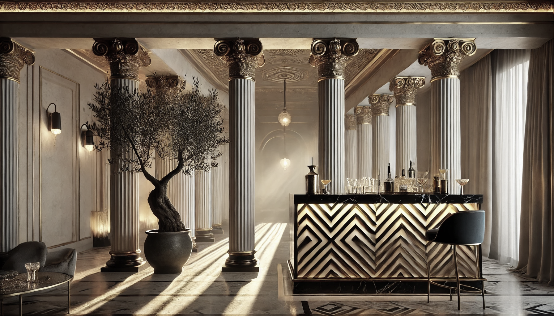
I think of my website as a kind of commonplace book—a space to gather my thoughts, explore ideas as they come to me, and give form to my creative output. Visiting a “personal” website like this, I think should be like dropping by for a coffee a beer. In this space you can get a sense of my interior thought world. I wonder if in the future it won’t feel a lot more like that, like dropping by. Digital space will feel more like the material world; you will enter my rooms, and see the spaces that I have curated. The tasteful back-lit olive tree in the corner. The sound of birds coming in through the Greco-Roman colonnades. The clink of a glass as its put down on a black marble bar gilded with geometric patterns. We will run our fingers along the contours of such aesthetic particulars. Our tastes will inform the spaces we create, and the spaces that we occupy.
Website design, in my view, has a lot in common with interior design. ‘Websites’ will no longer be the appropriate term, but these domains will become one and the same. In this future, truth, reason, and compute will all be cheap, essentially worthless, being infinitely available to everyone all the time. So, in such a reality, you obviously would not enter someone else’s domain in order to learn a fact. Rather, what is of value would be some interplay between relationships and aesthetics.
I made a related point in a previous article regarding taste;  an artificial intelligence in the future may be able to perform any task you want, do any job, but it will not be able to tell you what spaces you like to inhabit, that speak to your soul. These will be our museums of aesthetic delight. These pleasure gardens.
In such a world, the value of these domains will lie in their ability to surprise, to captivate, to resonate. They will not exist to answer questions but to spark a childlike wonder of things—to draw you into a conversation with the space itself, with its creator, and with your own sensibilities. Like stepping into a friend’s gallery, you’ll find yourself lingering over the unexpected: the interplay of shadows, sounds held in a moment, some curious juxtaposition of things. These spaces will be less about utility and more about communion—a meeting place for feelings, and experiences that lie beyond any algorithm.
With this analogy that I’ve painted, however, I have cast you, the reader, into this virtual domain as a distinct being. I imagine such distinctions as dissolvable: it’s one thing to experience my aesthetic appreciations as you, and another to experience it as me. There’s the experience, and then there is the experiencer. The world is showing up differently to me now, in my late 30s, than it did when I was a child. Our inexplicable states of being are constantly shaping the way we interface with reality. Yesterday, I wrote nothing; I felt no compulsion to do so—nothing was fizzing. Today, though, the words are flowing nicely. Being able to manipulate such underlying impulses would be glorious. I recall catching glimpses of alternative tracks of perception, I would love to fall in, like Proustian moments of eternal recurrence. It brings to mind psychonauts who use psychoactive substances to explore alternative states of consciousness. We will be “cybernauts,” playing our way across rooms, filled with levels of granular aesthetic attributes currently beyond our imagining.

Given this vision of multi-sensory digital experience, we can begin bringing elements of this into our website design now. When we’re creating or curating, I don’t see much difference between the two; there’s a distinction to be made between recognizing that something looks good and is done well, and recognizing when something reflects our own unique aesthetic preferences. While there are many stylish templates available out there, no generic template is going to fully reflect our particulars, the essence of our soul. We’re going to need to go deep. Obviously, when it comes to website design, elements like spacing, layout, typography, images, and color are minor details in the grand scheme of things. Is anyone’s soul really going to be captured in a website? I’m not so sure. But it’s a means to an end. In going through this process, you’re, in effect, coding your aesthetic DNA into the universe—you’re giving tomorrow’s supercomputers something to work with. You are, in essence, programming your soul into the future.
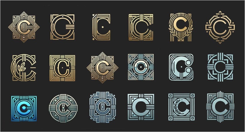
Most of the images on my website are created using ChatGPT. I go through a prompting and curating process, trying to find what works. I considered changing my website logo. I’ve been experimenting with it. The logo is currently the letter ‘C’ - the first letter in my surname – Connolly. I used a monochromatic color palette, it has a flowing, wave-like curve to it, and I aimed to achieve a balance between minimalism and visual intrigue. On the home page the logo is static, on other pages when you hover over it, it changes from a darker color to an off white, and it slightly enlarges. Wherever the logo appears throughout the website it acts as a link to bring you back to the home page.
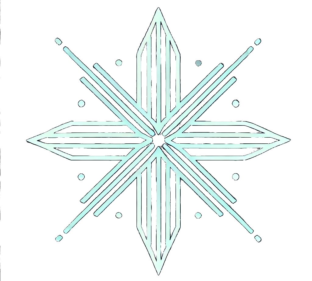
Given my affinity for art deco, I decided to iteratively refine my logo to reflect that. See images below. My prompts included: art deco, images which invoked technology, futurism, neoclassical design; I like light blue, I think it invokes a kind of electric type feel. What you see below is a selection of what most appealed to me. The three in the far-right column are probably my favorites. Ultimately, however, I don’t think any of them are as good as my current logo. And so, I’m sticking, for now.
I went through a similar process for selecting the fleurons on my website. Fleurons are those decorative typographical elements you find between some paragraphs. I chose them to create a more intentional transition from one paragraph—or one idea—to the next. I think the ones I chose hit the sweet spot; they make the reader’s experience better, serving a utilitarian purpose, marking that more intentional transition, and I like the way they look, sitting at the intersection between a forward-looking art deco past, and tomorrow’s cyber future. In the end, design is not just about aesthetics but about creating spaces — “real” or digital — that resonate with who we are.
